
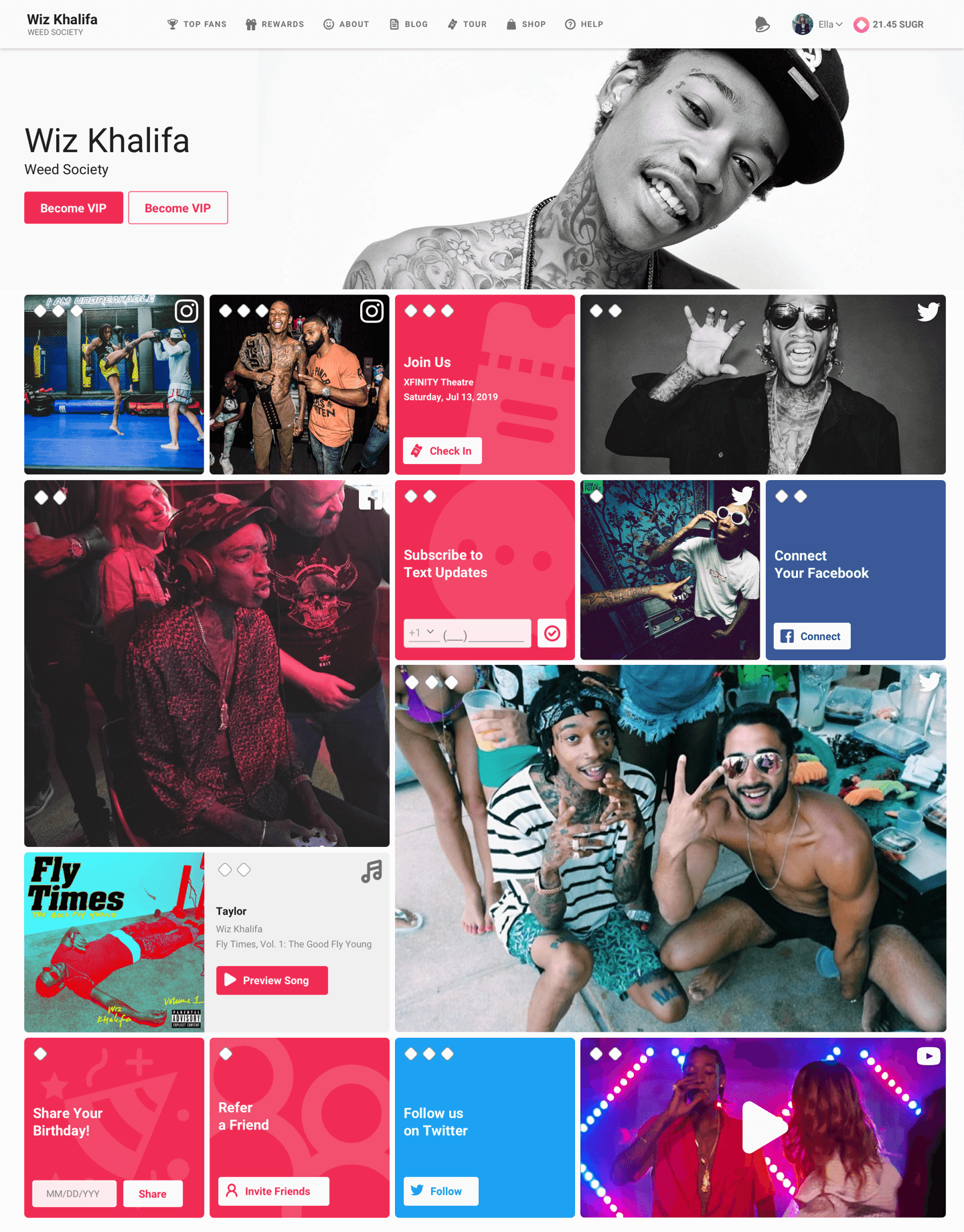
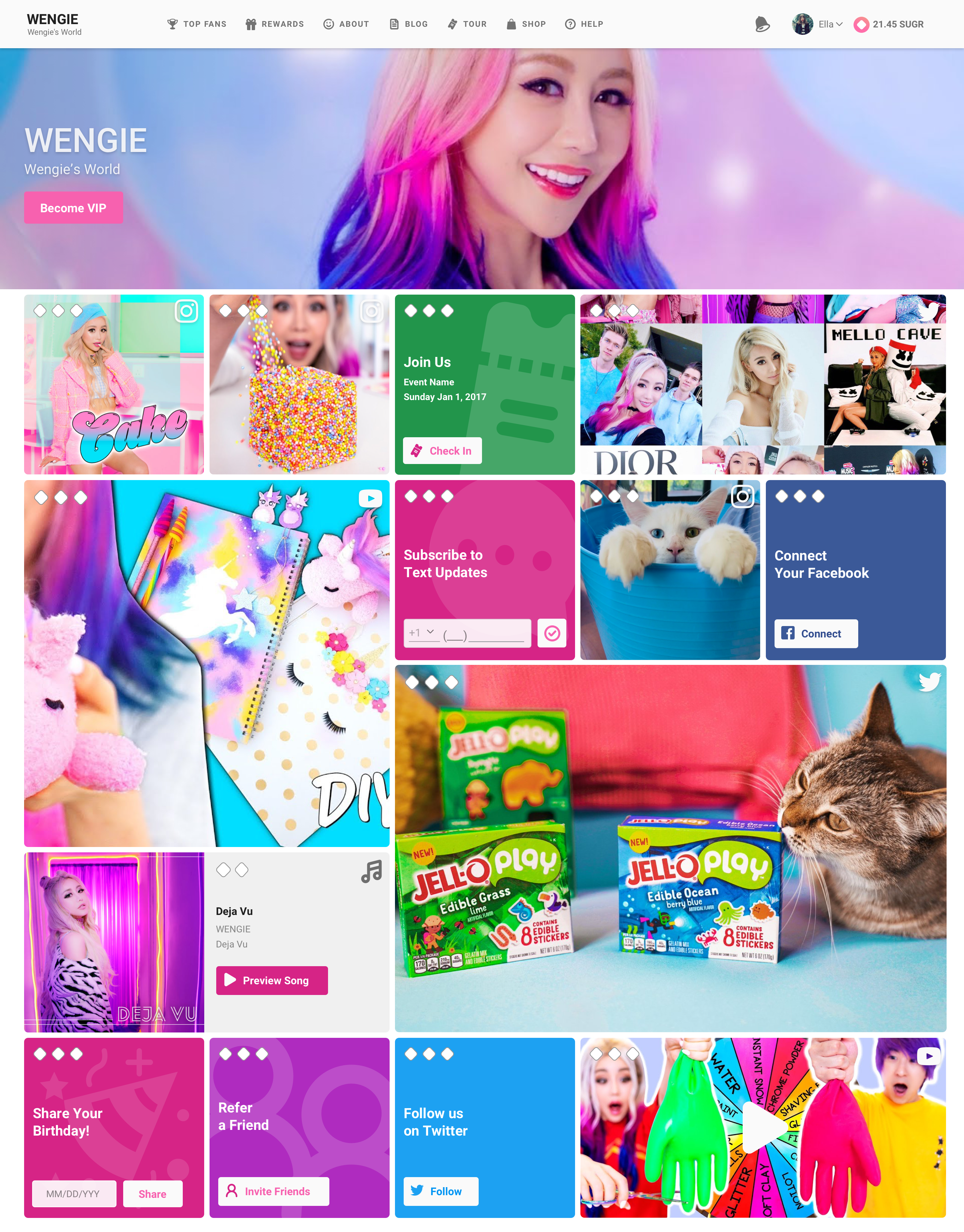
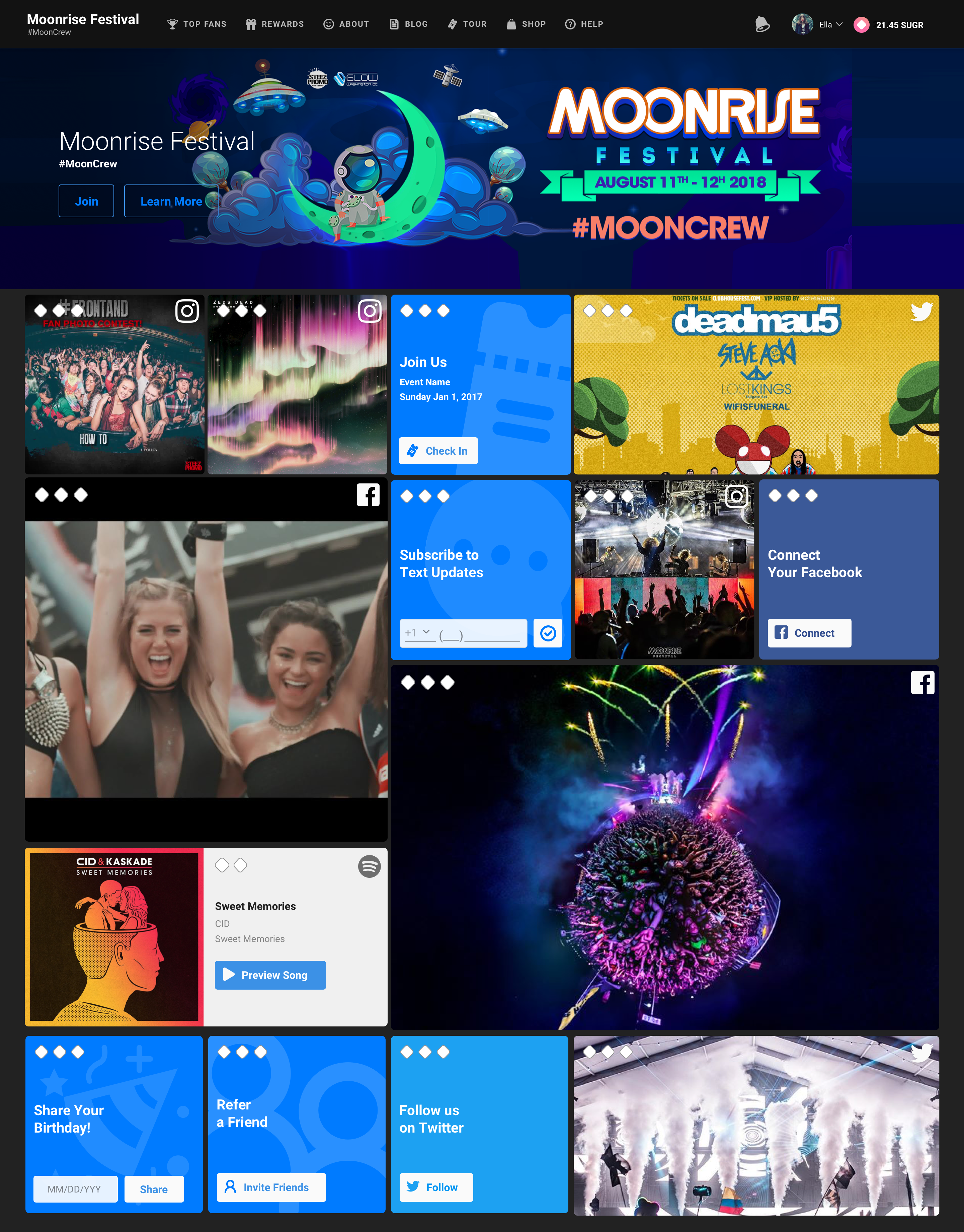
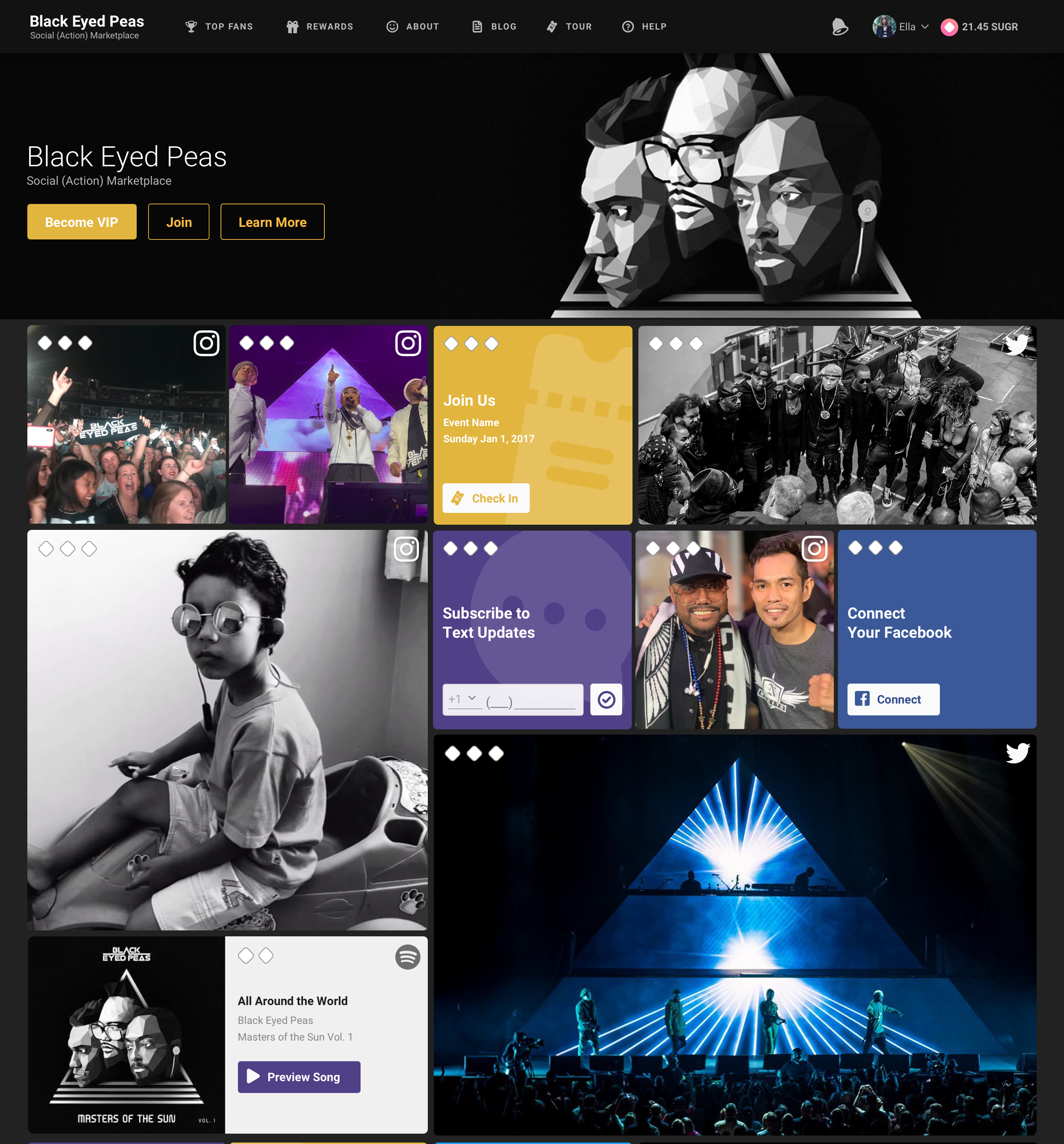
Sweet was a loyalty program that helped companies and high profile individuals enhance their connection with their audience and followers through social media engagement in exchange for rewards.
table of contents
project
Product Design
Web Application
client
sweet.io
agency
Internal
timeline
2017, 4 weeks
...
key goals
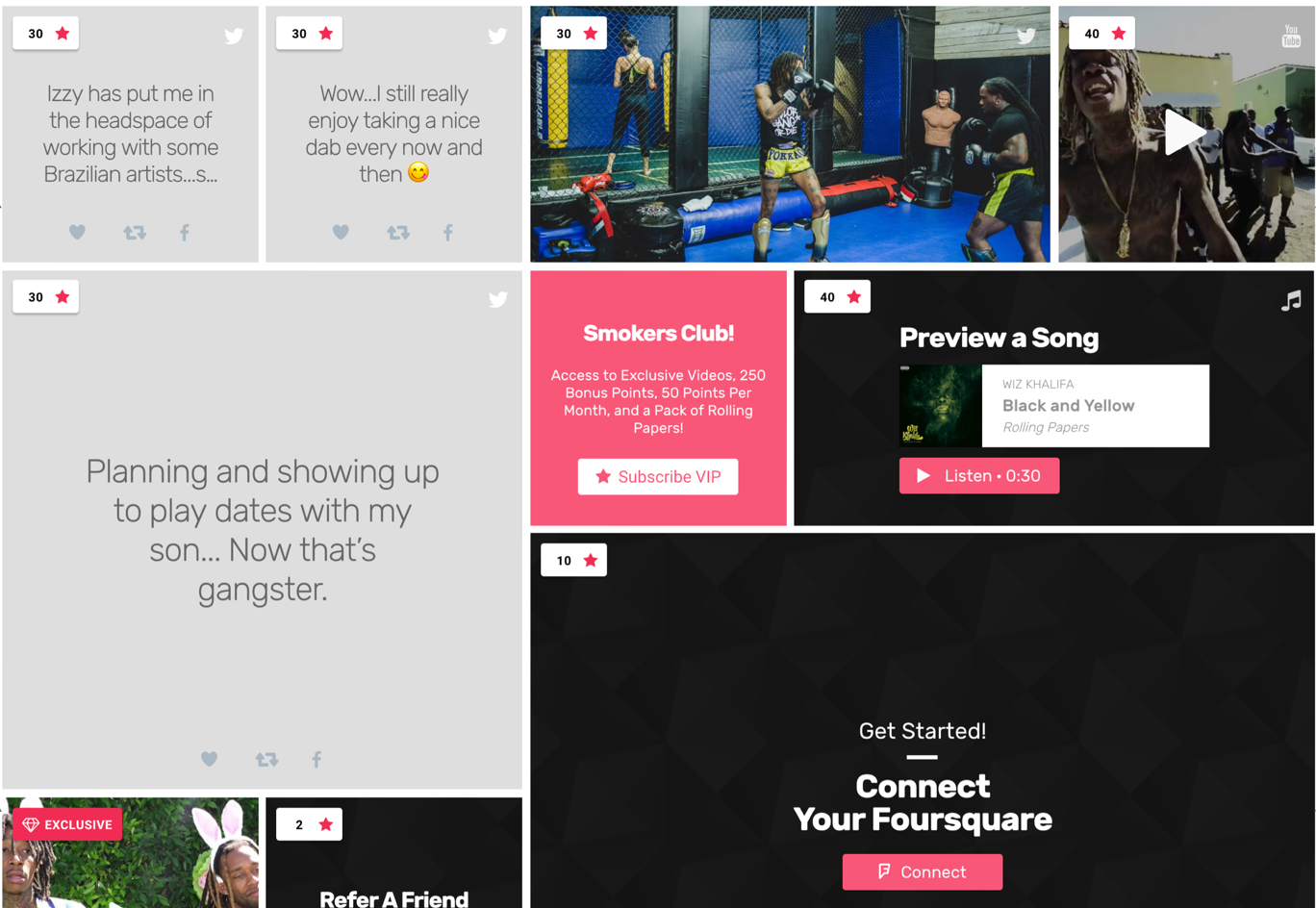
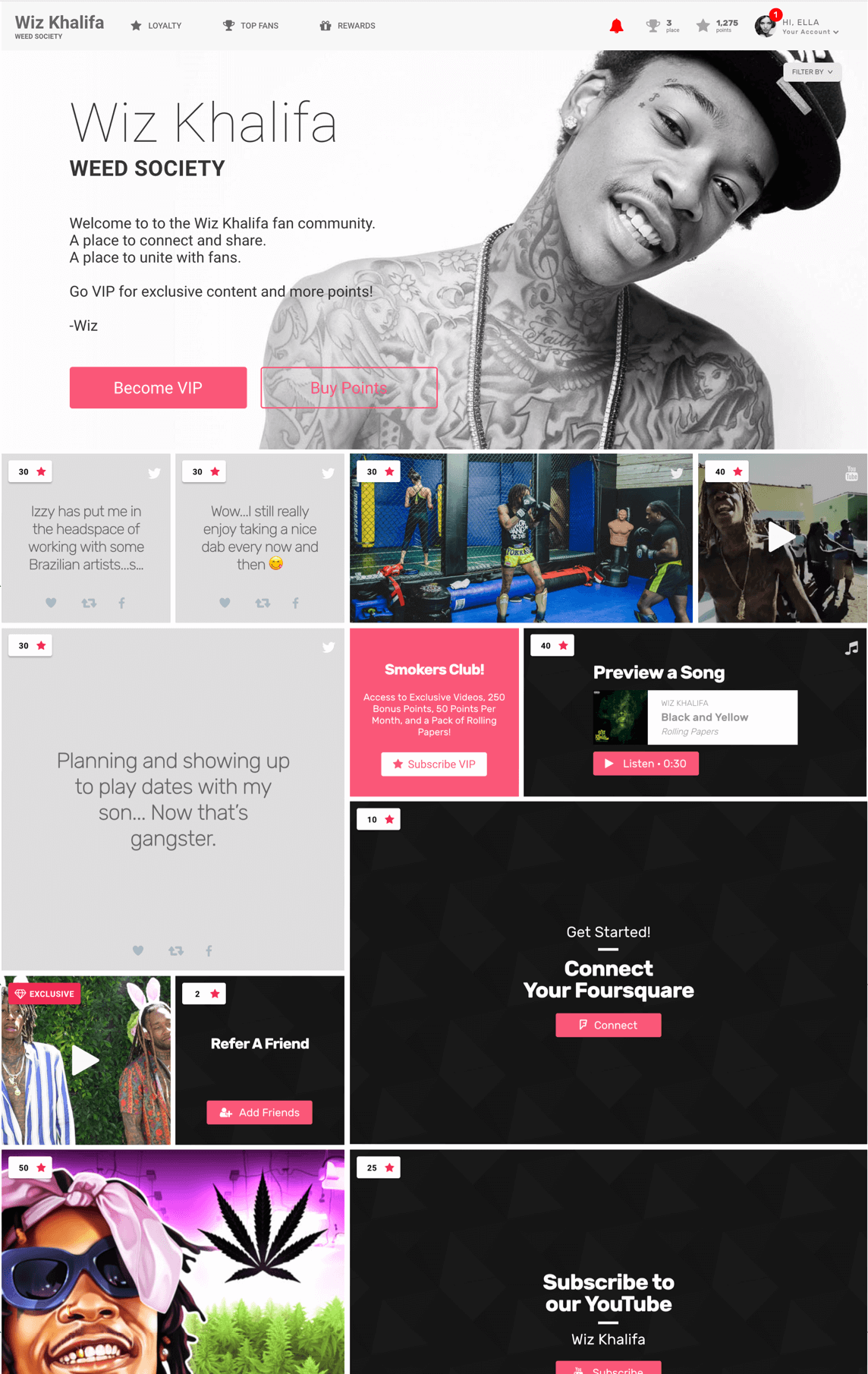
The user dashboard needed visual adjustments to be pleasing to the eyes, easier to understand and navigate in order to increase user engagement and clientele. This case study attempts to explain the process of establishing a visual design system for Sweet.io, highlighting the significant issues encountered, solutions executed, and demonstrating the design system's advantages to the client.
discovery & research
understanding the problem and establishing goals
I identified the core problems in Sweet's design process by conducting stakeholder interviews, gathering user feedback, and performing thorough analysis. These issues included inconsistencies in UI components, slow design-to-development hand offs, and an absence of established guidelines.
The following goals for the design system were established:
- Improve design consistency and coherence
- Streamline the design and development process
- Establish a single source of truth for design resources
assessing the existing design assets and resources
During the discovery phase, it was essential to evaluate the client's existing design assets and resources to determine their strengths and weaknesses, as well as areas for improvement. This evaluation included a heuristic assessment, which helped us identify usability issues and better understand the user experience.
Heuristic Evaluation Process
I set aside time to assess the current dashboard interface, with a focus on these key usability principles:
a. Visibility of system status
b. Match between the system and the real world
c. User control and freedom
d. Consistency and standards
e. Error prevention
f. Recognition rather than recall
g. Flexibility and efficiency of use
h. Aesthetics
i. Help users recognize, diagnose, and recover from errors
j. Help and documentation
identifying issues and areas for improvement
The heuristic evaluation revealed several usability issues and inconsistencies in the client's digital products, including:
Inconsistent UI components
Various instances of the same UI components had different designs and behaviors, leading to confusion and inefficiency for users.
Lack of feedback
Users were not always provided with clear feedback on the results of their actions, leading to uncertainty about the system's status.
Complex navigation
The navigation structure was not intuitive, making it difficult for users to find information and complete tasks.
Inconsistencies in language and terminology
Inconsistent usage of language and terminology across different products resulted in confusion for users.
Lack of error prevention and recovery
Users were not always provided with clear guidance on how to prevent or recover from errors.
prioritizing issues and defining solutions
After identifying the usability issues, we prioritized them based on their impact on the user experience and the effort required to address them. This prioritization allowed us to focus on high-impact issues and develop solutions that would be incorporated into the design system.
For example, to address the inconsistent UI components issue, we developed a unified component library that ensured consistency across all digital products. To improve navigation, we established a set of best practices for designing intuitive and user-friendly navigation structures.
integrating findings into the design system
The results of the heuristic evaluation informed the development of the design system, ensuring that it addressed the identified usability issues and improved the overall user experience.
The design system included:
a. Consistent UI components and patterns
b. Clear feedback mechanisms for user actions
c. Best practices for navigation design
d. Standardized language and terminology guidelines
e. Error prevention and recovery guidance
By incorporating the findings of the heuristic evaluation into the design system, we were able to create a more user-friendly and consistent experience for the Sweet Dashboard. This approach ensured that the design system not only addressed the client's specific challenges but also improved the overall usability of the product.


design system development
creating the visual language
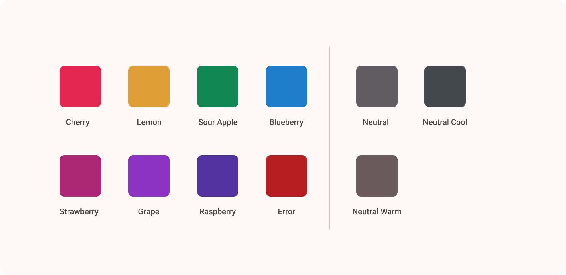
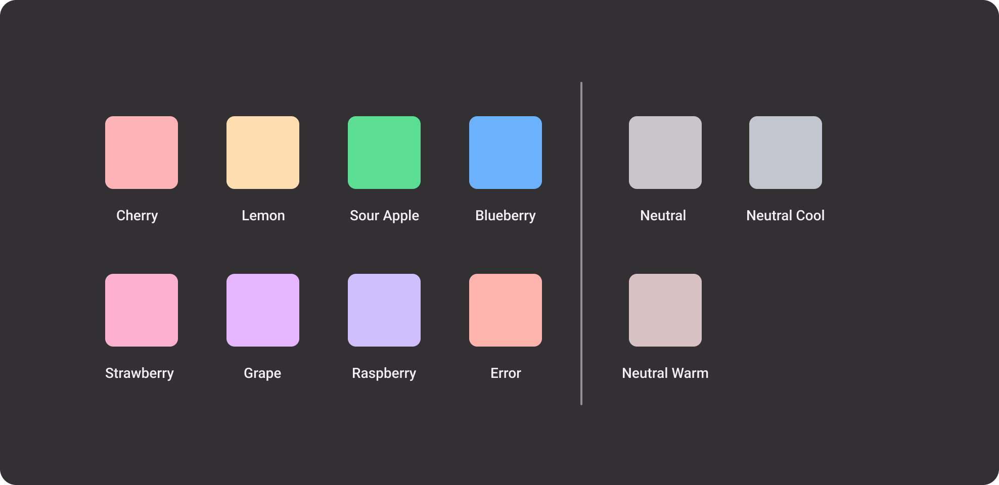
We crafted a unified visual language for the Sweet Dashboard, featuring a flexible color palette, well-defined typographic hierarchy, iconography, and image guidelines that harmonized with the company's brand identity.
building the component library
A comprehensive component library was created, covering UI components, patterns, layouts, and responsive design considerations. Components were designed to be modular, customizable, and easily integrated into the client's development environment.
developing the documentation
Thorough documentation was created, providing usage guidelines, best practices, and accessibility standards for each component and design pattern in the system
.
establishing a collaboration and feedback process
Regular design reviews and feedback loops were established with stakeholders to ensure continuous improvement and alignment with the dashboard's evolving needs.
measuring success
and impact
identifying key performance indicators (kpi)
kpi's such as user engagement, client acquistion, design consistency, development time, and design system adoption rate were identified to measure the success of this design system.
The updated design system significantly enhanced the platform's aesthetics and user experience. Over the course of a year, user engagement on the platform more than doubled, and the number of clients signing up for Sweet also doubled. Additionally, the workflow between front-end engineers and myself became much more efficient.
Selected Works
TECKMECKBranding & Identity
Athlete ManagerProduct Design

ReactionsProduct Design

NEXTSTOREBranding & Identity

CannaPagesProduct Design

Sweet MarketplaceProduct Design