NEXTSTORE
Got extra space? Turn it into cash.
The nextstore platform connects you with people
in need of storage. Whether it’s a spare room, garage, or closet, you can rent it out hassle-free. Simple, secure, and a win-win for everyone.
table of contents
project
Branding & Identity
client
nextstore
agency
Internal
timeline
2020, 4 Months
logo marks
This is their graphic symbolic representation, designed with minimal text to set their business apart. Core values paired with the graphic symbol or emblem help the public associate an image with a service or brand. It can be used independently of the wordmark.
combination marks
This mark is a combination of their glyph and wordmark, which they alternatively use to distinguish their business from others.




voice & tone
At nextstore, their customer support feels like chatting with a knowledgeable friend. They communicate clearly and compassionately, balancing expertise with genuine care. The goal is to make every
customer feel understood, supported, and empowered.

colors
At nextstore, they have these primary colors, shades and tints that they use throughout their branding materials and products
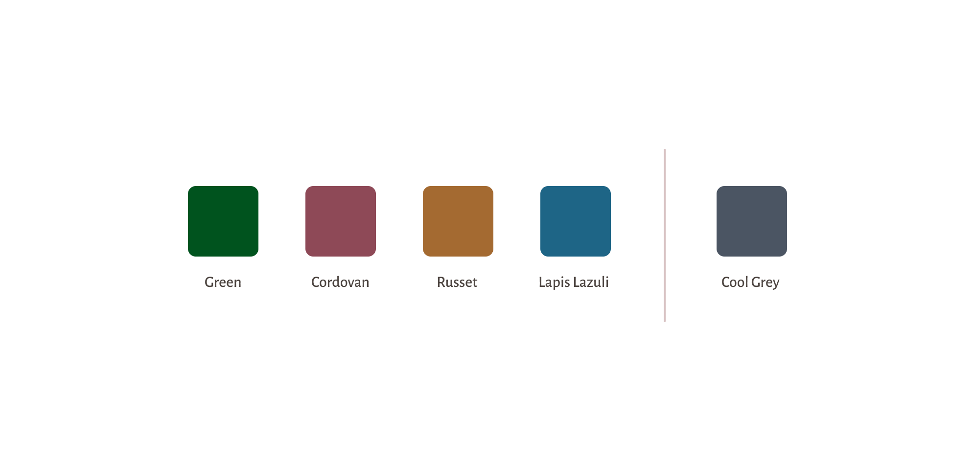
Primary and secondary colors against a light background
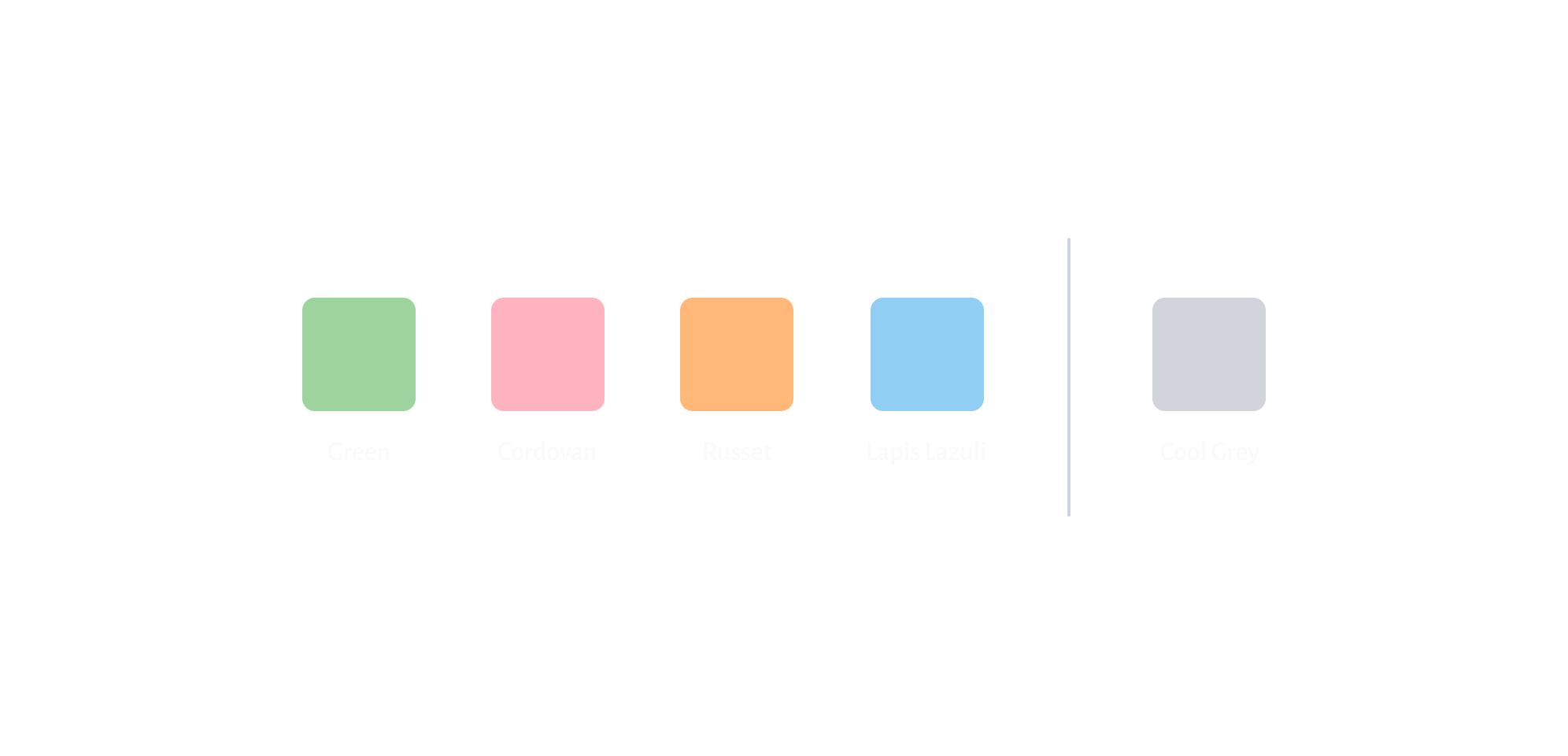
Primary and secondary colors against dark background
accessibility
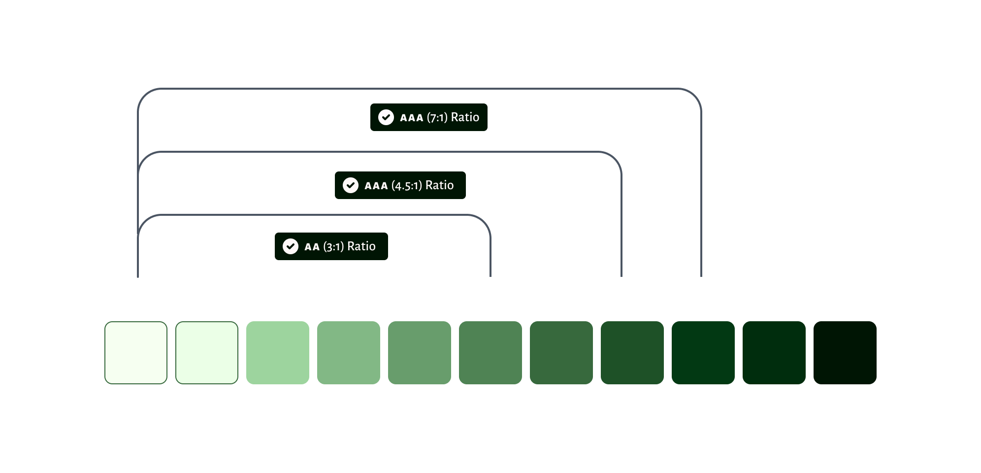
This color scheme is designed to comply with color contrast
accessibility standards. The tonal palette strategy is crucial for ensuring that any color scheme is accessible by default. By using colors based
on their tonal distance, we guarantee that contrast requirements
are met, irrespective of changing hues.






typography
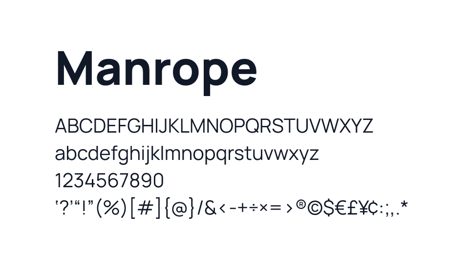
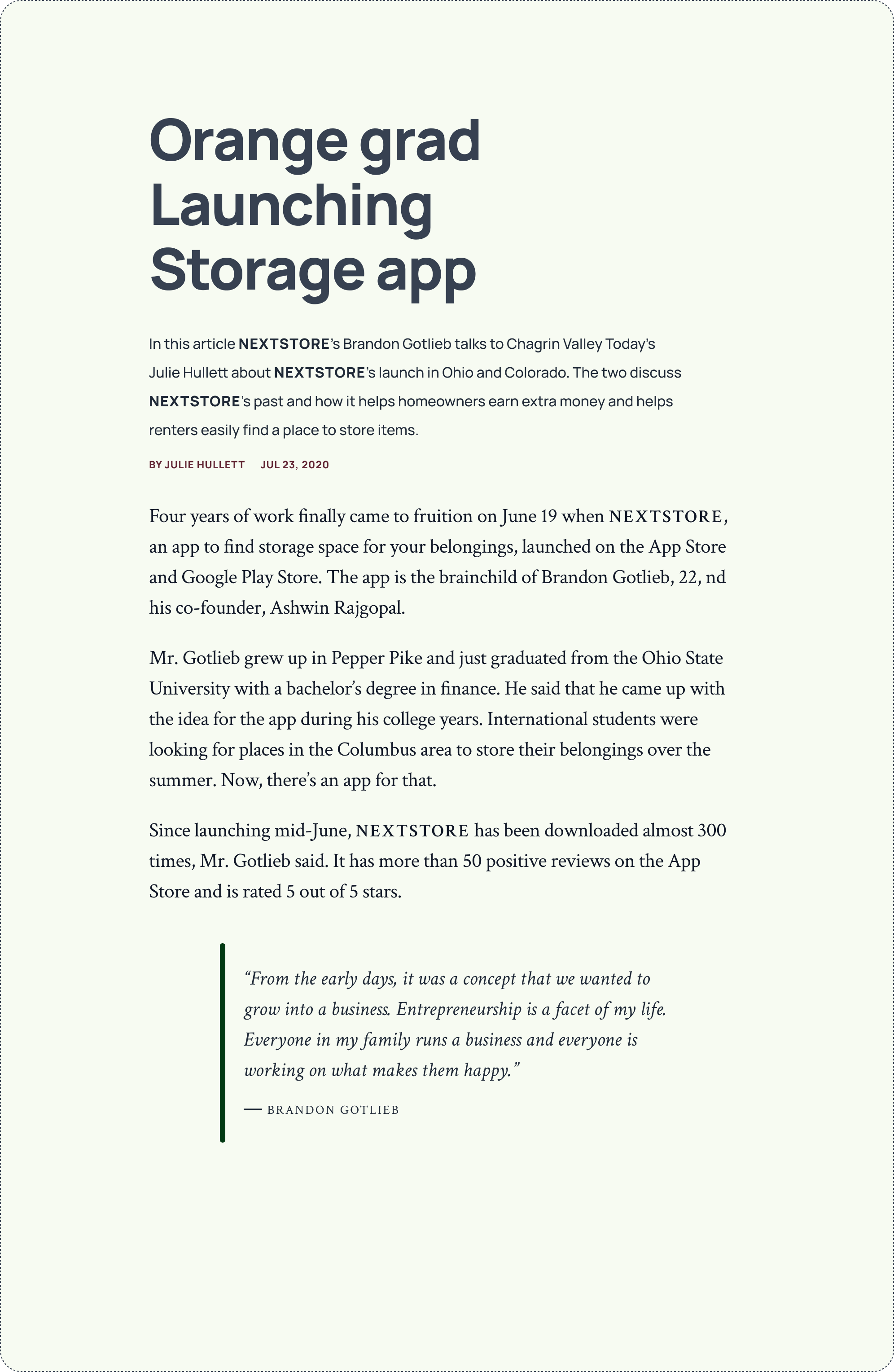
The primary typeface at nextstore is Manrope.
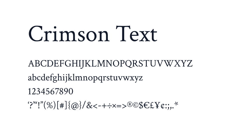
They also use Crimson Text as body type for their
blog and editorial material.
type sample
Selected Works

TECKMECKBranding & Identity

Athlete ManagerProduct Design

ReactionsProduct Design

CannaPagesProduct Design

Sweet.io (2017)Product Design

Sweet MarketplaceProduct Design